카테고리 없음
Components - Selection controls(Checkbox, Radio, Switch)
알 수 없는 사용자
2015. 9. 6. 02:39
출처 : http://www.google.com/design/spec/components/selection-controls.html
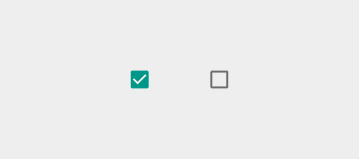
Checkbox
Checkboxes allow the user to select multiple options from a set.
If you have multiple options appearing in a list, you can preserve space by using checkboxes instead of on/off switches.
If you have a single option, avoid using a checkbox and use an on/off switch instead.
Light
On: Swatch 500, Opacity 100%
Off: #000000, Opacity 54%
Disabled: #000000, Opacity 26%
Dark
On: Swatch 500, Opacity 100%
Off: #FFFFFF, Opacity 70%
Disabled: #FFFFFF, Opacity 30%
Radio button
Radio buttons allow the user to select one option from a set. Use
radio buttons for exclusive selection if you think that the user needs
to see all available options side-by-side.
Otherwise, consider a dropdown, which uses less space than displaying all options.
Light
On: Swatch 500, Opacity 100%
Off: #000000, Opacity 54%
Disabled: #000000, Opacity 26%
Dark
On: Swatch 500, Opacity 100%
Off: #FFFFFF, Opacity 70%
Disabled: #FFFFFF, Opacity 30%
Switch
On/off switches toggle the state of a single settings option. The
option that the switch controls, as well as the state it’s in, should
be made clear from the corresponding inline label. Switches take on the
same visual properties of the radio button.
The on/off slide
toggle with the text “on” and “off” included within the asset is
deprecated. Use the switch shown here instead.
Light
Thumb On: Swatch 500, Opacity 100%
Track On: Swatch 500, Opacity 50%
Thumb Off: Grey 50, #FAFAFA, Opacity 100%
Track Off: #000000, Opacity 26%
Thumb Disabled: Grey 400, #BDBDBD, Opacity 100%
Track Disabled: #000000, Opacity 12%
Dark
Thumb On: Swatch 200, Opacity 100%
Track On: Swatch 200, Opacity 50%
Thumb Off: Grey 400, #BDBDBD, Opacity 100%
Track Off: #FFFFFF, Opacity 30%
Thumb Disabled: Grey 800, #424242, Opacity 100%
Track Disabled: #FFFFFF, Opacity 10%
Use the outer radial reaction only on form factors that favor
finger touch, where interaction may obstruct the element completely. For
desktop usage with a mouse, you do not need this extra indication.