
The app bar, formerly known as the action bar in Android, is a special kind of toolbar that’s used for branding, navigation, search, and actions.
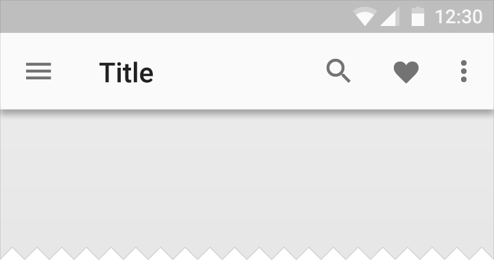
The nav icon at the left side of the app bar can be:
- A control to open a navigation drawer.
- An up arrow for navigating upward through your app’s hierarchy.
- Omitted entirely if no navigation is required from this screen.
The title in the app bar reflects the current page. It can be an app title, page title, or a page filter.
Icons on the right side of the app bar are app-related actions. The menu icon opens the overflow menu, which contains secondary actions and menu items like help, settings, and feedback.

On the left: Nav icon, title, and filter icon
On the right: Action and menu icons
Light

Dark

Colored

Transparent
Title color
In an app bar, all icons should be the same color.
The title can have a distinct color from the icons if increased visual hierarchy is needed. Distinct title colors work best on backgrounds with enough contrast for both white and black glyphs.

Single color (default)

Distinct title color
Metrics
Default heights:
Mobile Landscape: 48dp
Mobile Portrait: 56dp
Tablet/Desktop: 64dp
For extended app bars, the height is equal to the default height plus content increment(s).

App bar height: 56dp
App bar left and right padding: 16dp
App bar icon top, bottom, left padding: 16dp
App bar title left padding: 72dp
App bar title bottom padding: 20dp


The app bar with significantly increased height for prominence
App bar height = 128dp


Action area height: 56dp
Title area height: 80dp
Title area bottom padding: 8dp
Description area height: 72dp
Description area bottom padding: 16dp


App bar height: 64dp
App bar left and right content padding: 24dp
App bar icon top and bottom padding: 20dp

Prominent app bar height: 128dp
App bar left and right icon padding: 24dp
App bar left content padding: 80dp

Incremental keyline is set by the app bar height, with a height of 64dp, which determines the keyline increment.
App bar height: 64dp
Menus
A menu is a temporary sheet of paper that always overlaps the App Bar, rather than behaving as an extension of the App Bar.

Example of App Bar

Example of menu in an App Bar

Example of menu in an App Bar

Example of menu in an App Bar

Example of menu in an App Bar