The following specs are provided for mobile apps.
Font and color
- Text: Roboto Regular 16sp, #000 87%
- Title (optional): Roboto Regular 16sp, #000 54%
- Default bottom sheet background fill: #FFF
- Transparent overlay fill: #000 20%
List-style bottom sheet
Screen edge left & right margins: 16dp
Top and bottom margins: 8dp
List-item height: 48dp
List icons: 24x24dp, middle vertical alignment
Text associated with icon: 32dp horizontal padding

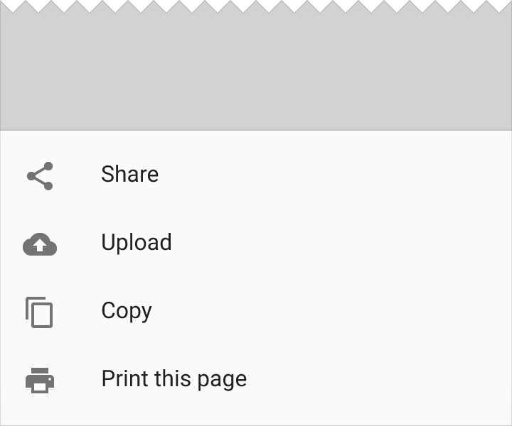
Redline for list-style bottom sheet in a mobile app.

List-style bottom sheet in a mobile app
List-style sheet with header
Screen edge left & right margins: 16dp
Space below the top list: 7dp
Divider line: 1dp
Space above second bottom sheet: 8dp
List-item height: 48dp
List icons: 24x24dp, middle vertical alignment
Text associated with icon: 32dp horizontal padding
List title height: 56dp

Redline for list-style sheet with header

List-style sheet with header
Grid-style bottom sheet with icons
Screen edge left & right margins: 24dp
Vertical space between grid lists: 16dp
Grids list icons: 48x48dp, middle vertical alignment, equally distributed across the grid
Grid list text area: 16dp tall, center-aligned below each icon
Padding below grid: 24dp

Redline for grid-style bottom sheet that contains a standard set of actions for other apps

Grid-style bottom sheet that contains a standard set of actions for other apps
Bottom sheets slide up from the bottom of the screen and initially cover a portion of the screen.
The initial height of a bottom sheet is relative to the height of the list items (or grid rows) it contains. A bottom sheet should not initially have a height beyond its 16:9 ratio keyline, depending on how much content it contains. Bottom sheets may be swiped up to fill the height of the screen, with content that then scrolls internally.

The initial height of a bottom sheet should not extend beyond the 16:9 ratio keyline.

The minimum height of a bottom sheet is relative to the height of the list items it contains.
