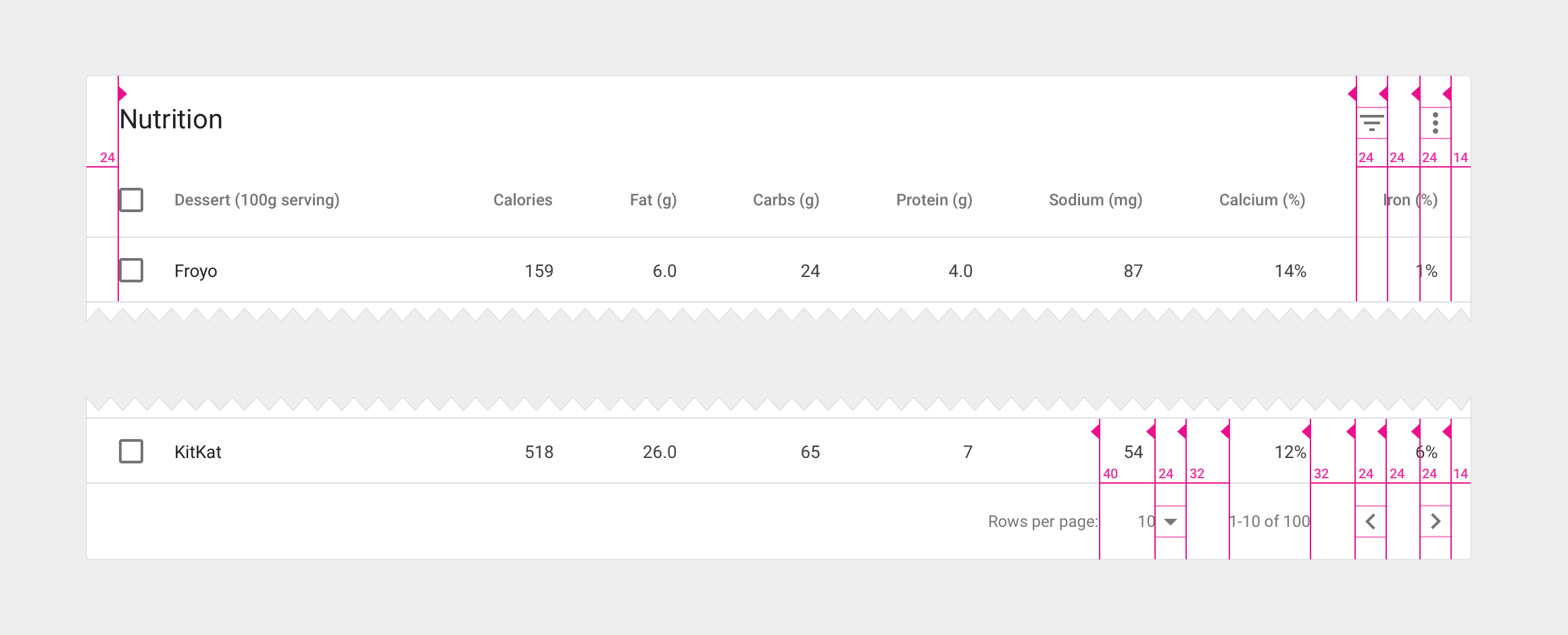
Tables can be embedded within a card, with table navigation and data manipulation tools available at the top and bottom.

Table card with header and footer
Card title
- 20sp Roboto Regular
- 87% black
Card action icons (header and footer)
- 24dp container
- 54% black
Footer pagination labels
- 12sp Roboto Regular
- 54% black
Alternate headers
Some table cards may require headers with actions instead of titles. Two possible approaches to this are to display persistent actions, or a contextual header that activates when items are selected.

Alternate headers for a table card
Action buttons
- Use borderless buttons
- Enable upon item selection
Colored header
- Use 50-value of secondary app color for background fill
- Display the number of items selected
- Display available contextual icons upon item selection